How we boosted Fixed Deposit conversions by 76%?

How we boosted Fixed Deposit conversions by 76%?

How we boosted Fixed Deposit conversions by 76%?

With 95% of Indians favoring FDs, this project streamlined the booking process to make it faster and more user-friendly.

With 95% of Indians favoring FDs, this project streamlined the booking process to make it faster and more user-friendly.

With 95% of Indians favoring FDs, this project streamlined the booking process to make it faster and more user-friendly.

With 95% of Indians favoring FDs, this project streamlined the booking process to make it faster and more user-friendly.

In India, most of individuals opt for Fixed Deposits due to their reliability and security. However, the procedure for booking them is frequently perceived as complex and time-consuming.

Discussing V0 flow

Discussing V0 flow

Discussing V0 flow

Discussing V0 flow

The flow looked like -

  • User goes through FD explore page

  • Selects Bank - Decides to invest

  • To book FD user goes to Bank’s website

  • Comes back & track on upstox

Problem statement

Problem statement

Problem statement

Problem statement

Despite the popularity of Fixed Deposits (FDs) in India due to their reliability and security, the booking process remains overly complex and time-consuming, leading to a significant drop-off in conversions. The fragmented process earlier resulted in only 4.5% of users who discovered FDs visiting the bank’s page, and just 2.5% of those successfully completing the booking. This low conversion rate underscored the need for a simpler, more efficient FD booking experience.

Breif

Breif

Revamping the flow to enhance UX

Revamping the flow to enhance UX

Revamping the flow to enhance UX

Duration

Duration

3 Weeks

3 Weeks

Stakeholders

Stakeholders

Darshan (Senior UX D)

Ronak (PM)

Shruti (Director - Design)

Darshan (Senior UX D)

Ronak (PM)

Shruti (Director - Design)

Darshan (Senior UX D)

Ronak (PM)

Shruti (Director - Design)

Initial idea

Initial idea

Initial idea

Initial idea

The primary goal was to enhance the user experience and integration with third-party platforms, creating a smoother and more seamless FD booking process.

The primary goal was to enhance the user experience and integration with third-party platforms, creating a smoother and more seamless FD booking process.

The primary goal was to enhance the user experience and integration with third-party platforms, creating a smoother and more seamless FD booking process.

The user research

The user research

The user research

The user research

We conducted brief Interviews with users to understand their approach to decision-making for fixed deposits. While users emphasized the value and reliability of FDs, they expressed frustration with the complexity of the booking process. Many users prefer to decide on the amount and tenure simultaneously, highlighting the need for clear, streamlined steps that prioritize simplicity and transparency.

We conducted brief Interviews with users to understand their approach to decision-making for fixed deposits. While users emphasized the value and reliability of FDs, they expressed frustration with the complexity of the booking process. Many users prefer to decide on the amount and tenure simultaneously, highlighting the need for clear, streamlined steps that prioritize simplicity and transparency.

We started with a Competitor analysis - aimed to pinpoint specific pain points causing friction in the FD booking process.
The findings showed that even simplified flows contained usability gaps, such as cumbersome steps and unclear details like interest rates and tenure options. These issues hindered users from making confident, informed decisions.

We started with a Competitor analysis, focusing on FD apps like Stable Money. A heuristic evaluation revealed usability issues, as even simplified two-step forms often included cumbersome steps and lacked clarity on key details like interest rates and tenure options, making informed decision-making difficult for users.

To gather user insights, we conducted brief Interviews with colleagues in the office, uncovering a strong preference for a quick, intuitive FD booking experience with clear, simple steps. Additionally, a Sentiment analysis on social media platforms like X (Twitter), Quora, and YouTube highlighted user opinions, showing appreciation for the security of FDs but also frustrations with the complexity and lack of transparency in the booking process.

Key findings 💡

  • Users emphasized wanting to decide on the tenure and amount simultaneously, as these are the most critical factors in their decision-making.

  • Users often had a specific bracket of tennure in their mind before booking an fd.

  • A lack of upfront visibility into interest rates and maturity benefits made the process feel uncertain and untrustworthy.

  • Users often didn’t understand the importance of completing VKYC during the process, seeing it as a separate and burdensome task rather than an integral step to secure their FD.

  • Simplified flows with fewer steps and less cognitive load were highly preferred, as users wanted to book their FDs quickly without unnecessary back-and-forth.

Key findings 💡

  • Users emphasized wanting to decide on the tenure and amount simultaneously, as these are the most critical factors in their decision-making.

  • A lack of upfront visibility into interest rates and maturity benefits made the process feel uncertain and untrustworthy.

  • They valued concise, hierarchical organization of key details (like nominee information and bank details) for easy verification before finalizing their bookings.

  • Users often didn’t understand the importance of completing VKYC during the process, seeing it as a separate and burdensome task rather than an integral step to secure their FD.

  • Simplified flows with fewer steps and less cognitive load were highly preferred, as users wanted to book their FDs quickly without unnecessary back-and-forth.

Design goals

Design goals

Design goals

Design goals

Book FDs in Seconds: Streamlined order flow for quick booking

Book FDs in Seconds: Streamlined order flow for quick booking

Clear Choices Offered: Early visibility of total gains to aid decision-making

Clear Choices Offered: Early visibility of total gains to aid decision-making

VKYC Reminders: Built-in prompts to complete VKYC on time (This was an insight from the data we had)

VKYC Reminders: Built-in prompts to complete VKYC on time (This was an insight from the data we had)

Enhanced “My Orders” Section

Enhanced “My Orders” Section

Reimagining the Order flow

Reimagining the Order flow

Reimagining the Order flow

Reimagining the Order flow

The order flow minimizes steps to ensure a quick and efficient investment process, enhancing user satisfaction and reducing drop-offs.

The order flow minimizes steps to ensure a quick and efficient investment process, enhancing user satisfaction and reducing drop-offs.

Order form screen

Order form screen

Order form screen

Order form screen

Design goals

  • Help users make decisions faster by simplifying key steps.

  • Enable seamless interplay between tenure and amount selection.

  • Provide users with clarity on interest payouts and maturity actions.

Why It Works (Final Iteration)

  • Clear focus on tenure and amount selection allows users to prioritize these decisions first.

  • Tenures are divided into intuitive brackets, with the highest-return tenure pinned at the start of the list.

  • Special interest rates for women and senior citizens are highlighted to encourage users to take advantage of these benefits.

  • Transparent layout ensures users can quickly finalize decisions with confidence.
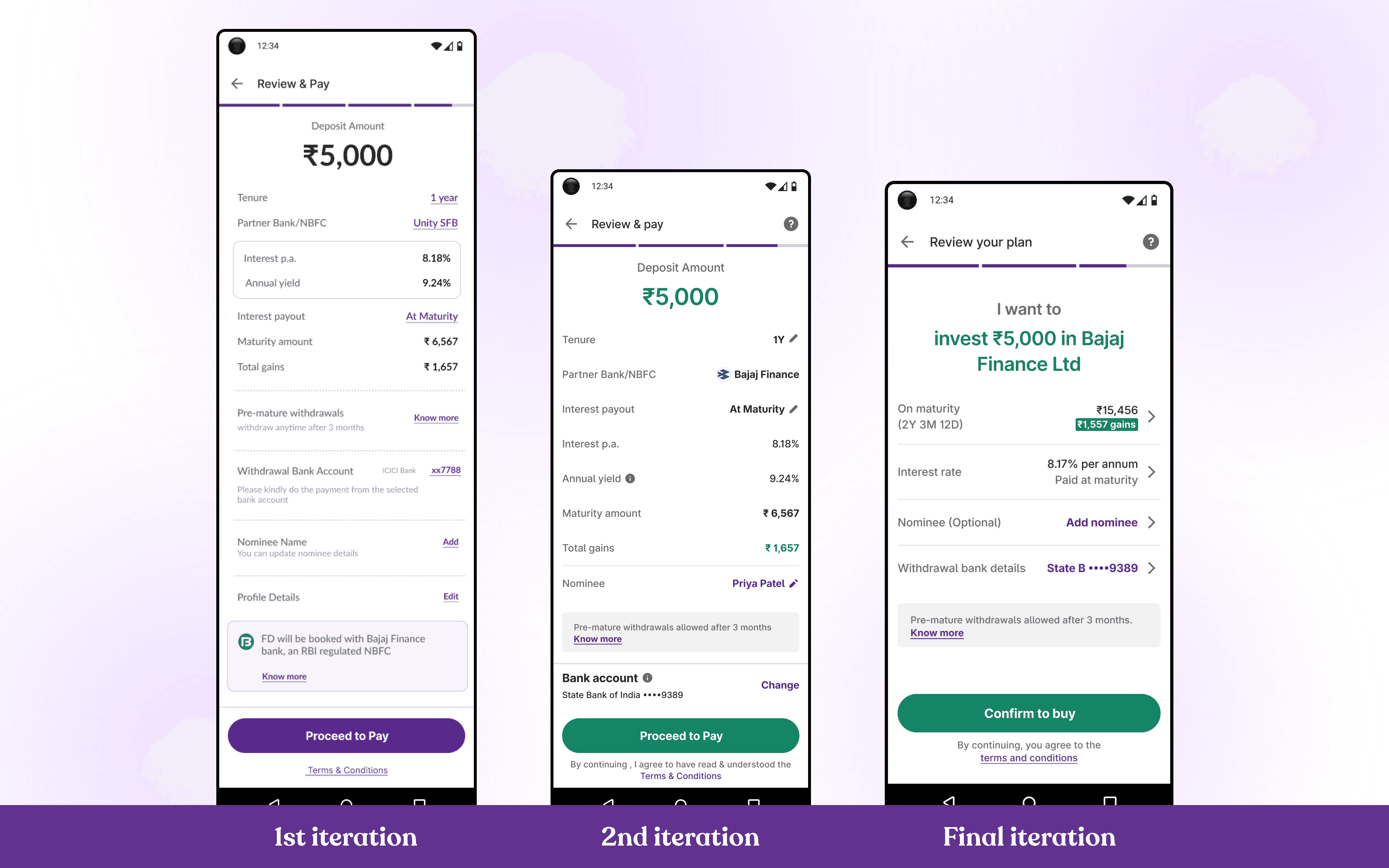
Review Screen

Review Screen

Review Screen

Review Screen

Design goals

  • Organize information hierarchically to reduce cognitive load.

  • Highlight critical inputs like nominee and bank details for easy verification.

  • Ensure users feel confident about their decisions before finalizing.

Why It Works (Final Iteration)

  • Grouped sections create a logical flow, making it easier to locate and review details.

  • Clear separation of nominee and bank information minimizes confusion and user errors.

  • Prioritizing key fields ensures users can quickly verify the most important details.

  • The streamlined layout enhances clarity, reducing the chances of missed inputs.

Order states

Order states

Order states

Order states

Order Placed (VKYC Not Required), where the FD is successfully booked without additional verification

Order Placed (VKYC Not Required), where the FD is successfully booked without additional verification

Order Placed (VKYC Required), where users are informed that VKYC must be completed for the booking to be finalized, and

Order Placed (VKYC Required), where users are informed that VKYC must be completed for the booking to be finalized, and

Error State

Error State

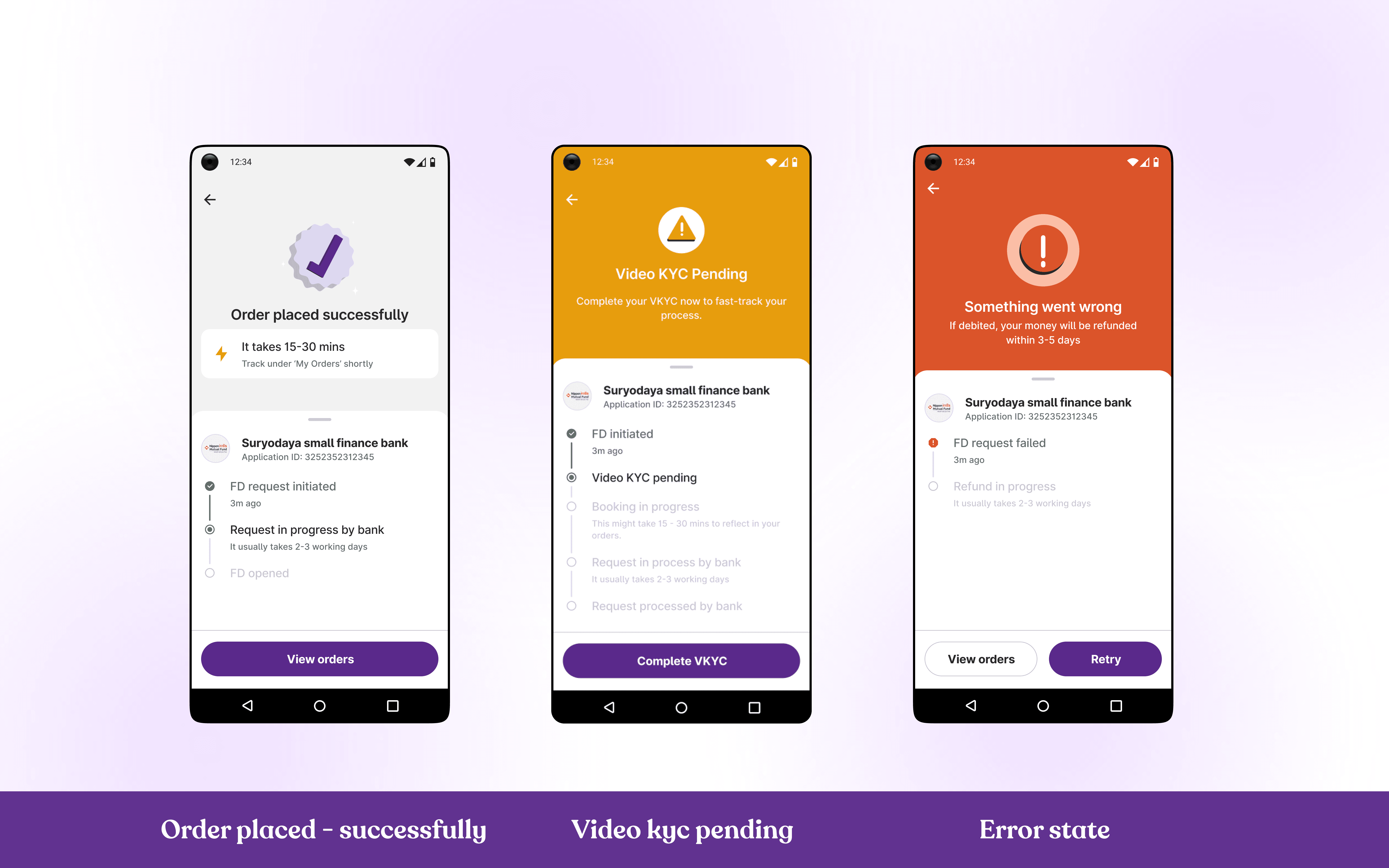
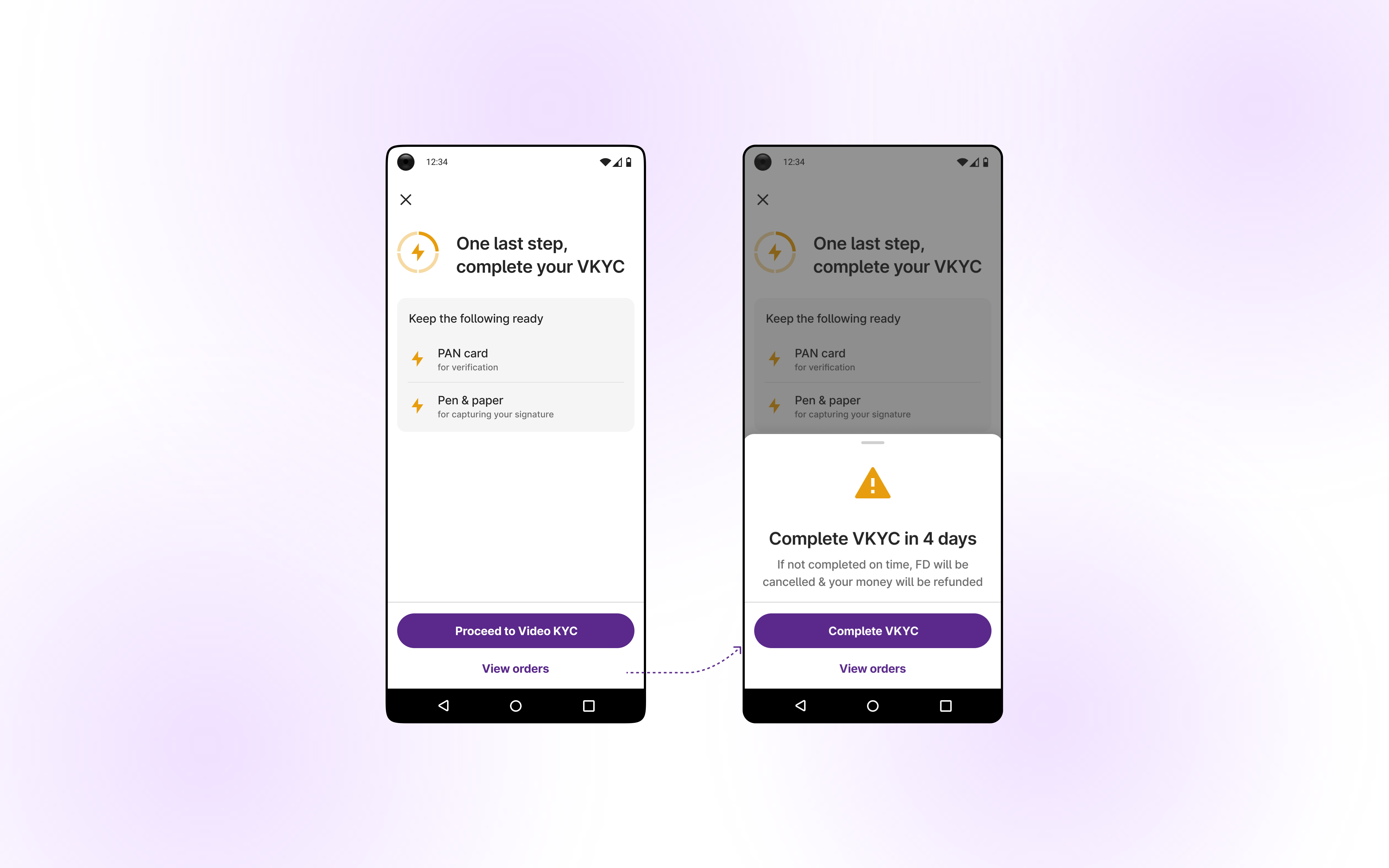
But is it truly nudging users effectively? Can we explore additional solutions? What if we frame incomplete video KYC as the final step to successfully book an FD?

Impact

Impact

Impact

Impact

Boosted user conversion by 76% by redesigning the Fixed Deposits Order Form and optimizing the investment funnel with streamlined flows for a faster, more user-friendly experience.

Whoa! Your FD is booked 💸

Whoa! Your FD is booked 💸

Whoa! Your FD is booked 💸

Whoa! Your FD is booked 💸