To optimize user journeys and cater to an expanded feature set, I designed multiple intuitive entry points and streamlined user flows. This strategy aimed to attract new users and establish Jar as a trusted platform.
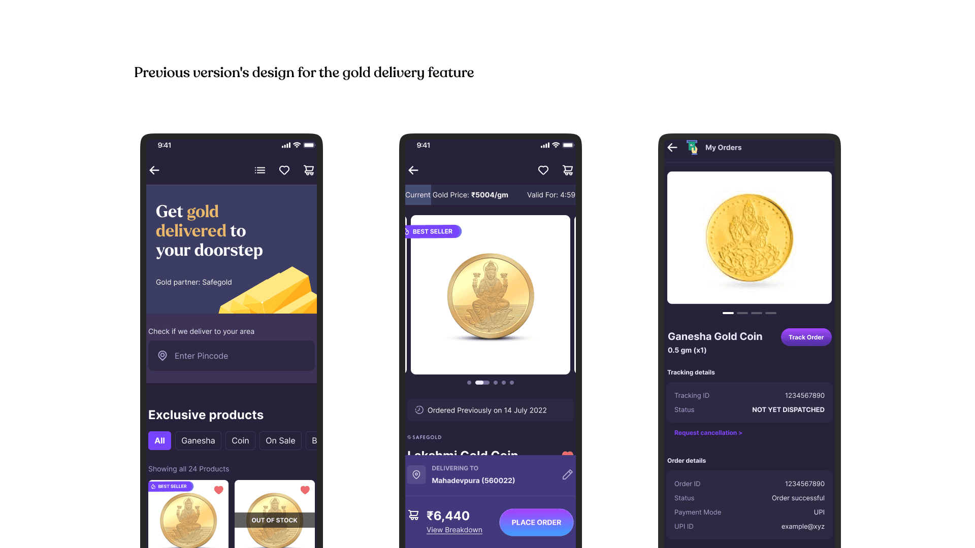
User research (data & interviews) revealed pain points & motivations. Mapped gold delivery flow & used "how might we" questions to design improvements. Collaborated with stakeholders on prototypes & iterative testing for a seamless user experience.

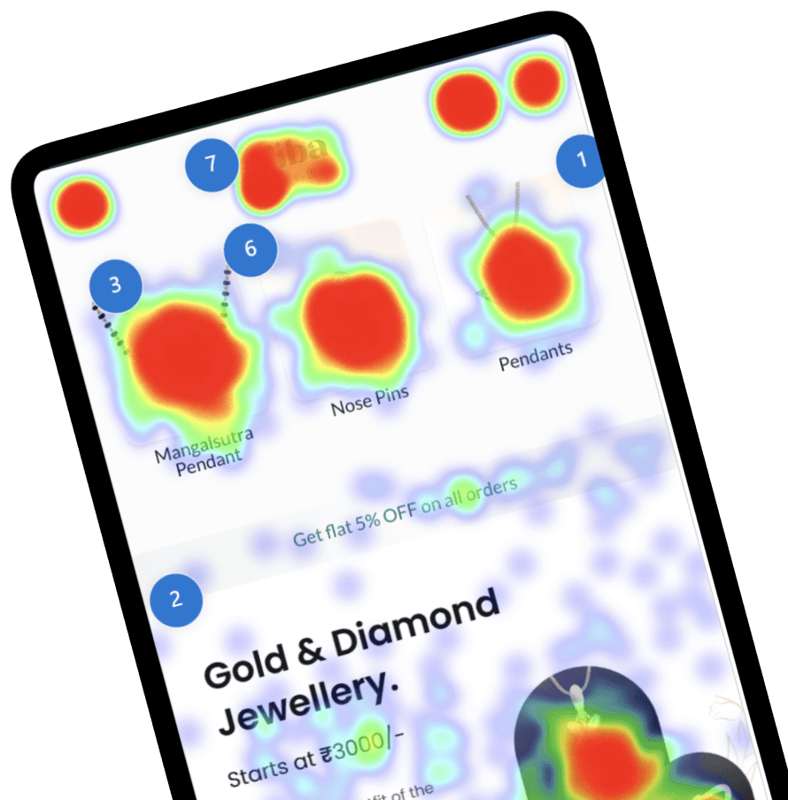
Leveraging a mixed-method approach, I analyzed Viba user behavior through Microsoft Clarity to identify friction points. Further insights into user experience, expectations, and pain points were gained via interviews with Jar users. This comprehensive understanding informed Viba's design and refinement process.
User research revealed three main pain points: a lack of trust in Viba, confusion about the checkout process—especially regarding the option to pay with Jar savings—and a limited number of entry points from Jar to Viba. These issues led to user hesitation and reduced engagement. Addressing these insights became key to refining the design and enhancing the user experience.

User interviews revealed that appealing jewellery designs were the primary motivation for users to click through and enter Viba from Jar. Additionally, attractive offers and promotions provided further incentive to explore the jewellery section.
The existing system hampered user experience with critical flaws. Limited filtering, sorting, and search features made finding specific jewelry pieces difficult. The landing page failed to capitalize on engagement opportunities by neglecting to showcase bestsellers and available coupons. Additionally, unclear order details pages frustrated users by obscuring critical information.
Solutions
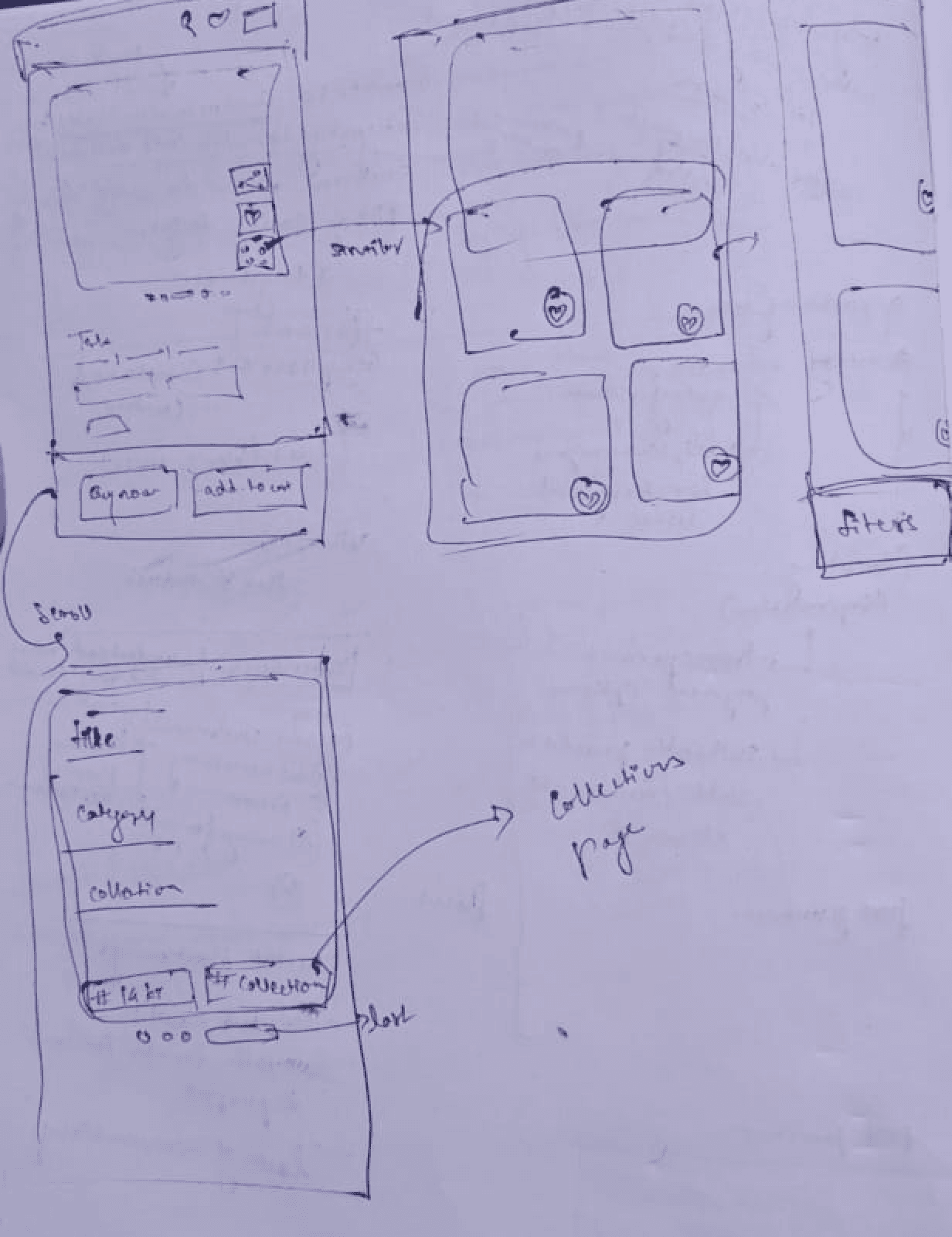
I have focused on the design decisions leading up to the pre-purchase phase. My goal was to create a seamless user journey from initial interaction with Viba through product exploration, ensuring that users could easily find and engage with the jewellery offerings.
1. How might we increase traction?
To drive more users towards Viba and encourage engagement, we looked at targeted entry points and enhanced visibility.
🤔 Highlight Viba to users with over 10k in Jar savings to leverage their existing interest by including it in "Recommended for You."
🤔 Reach all users during special occasions like Shubhmuhurat.
🤔 Add Viba promotions or links to successful transactions in Jar to capture user attention at key moments.
🤔 Utilize existing shortcuts to quickly direct users to Viba.
2. How might we improve the landing page?
To create a more engaging landing page, I used data-driven insights to guide the following solutions
🤔 Add categories to the first fold of the landing page, as this section received maximum clicks in viba's landing page.
🤔 A Comprehensive banner to announce offers or events and clickable best-selling jewelry to attract attention.
🤔Display coupons on the first fold to encourage instant engagement and retain users.
🤔Filters according to purities on landing page (users were most interested in filtering using purity).
🤔 Adding collectīons according to buying cases? may be gives them a reason to buy jewellery.
3. How might we improve the flow for users to find the jewellery they are looking for?
To make it easier for users to find specific jewellery items, we introduced solutions focused on search and navigation.
🤔 A search bar that shows comprehensive options to select from upon search.
🤔Quick actions menu on PDP, something similar to "view similar" but with filters.
🤔Recommended jewellery in landing page.